
Movie posters. We all love them. Chances are you have had them hanging in your bedroom growing up. Thirty years ago it might have been Batman. 20 years ago it might have been Titanic or The Matrix and this year, The Avengers: Endgame. When we love a movie it’s natural to want to collect what we can to connect ourselves to it. For me, that always meant owning the CD soundtrack and owning the poster.
This is not a list of my ten favorite movies of all time, even though many of these posters are of movies which are on that list (that list that might show up here in the future.) For this list I wanted to avoid multiple posters from the same movie series which is why there is only one Star Wars and Indiana Jones title each on here. I also didn’t want to feature a poster by the same director twice.
There are posters I wanted to include here that I love (The Breakfast Club, Chinatown, Reality Bites, The Untouchables, Close Encounters of the Third Kind, Reservoir Dogs, Bulworth, Heat and many, many, others) but for now, let’s just look at these ten one-of-a-kind works of art—or, my ten favorite movie posters:
10. L’avventura (1960)
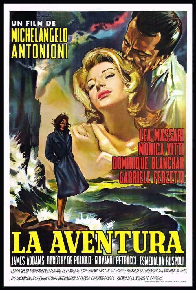
Michelangelo Antonioni’s L’avventura is the first title on this list featuring an Italian black and white movie from 1960 about comfortable, attractive adults seeking out human connection to each other, only to realize those connections are not that great after all. This glorious poster by Italian artist Carlantonio Longi (who also designed posters for Fellini and Leone) may look like the cover of a romance novel to some but there’s no denying it’s striking imagery. There’s a distant Monica Vitti being nuzzled by Gabriele Ferzetti while gazing down at Lea Massari standing quite close to some choppy waves on the shores of the Mediterranean. That dark purple sky above them all is not looking the nicest either. Stormy weather approaching indeed. This poster promises the viewer they might be in for a drama between three lovers but anyone who has seen Antonioni’s first chapter of his “isolation” trilogy (followed by La Notte and L’Ecclise) knows that’s not the case. This is a poster that’s mysterious, effective and undeniably gorgeous. This was why poster frames were invented.
9. Back To the Future (1985)
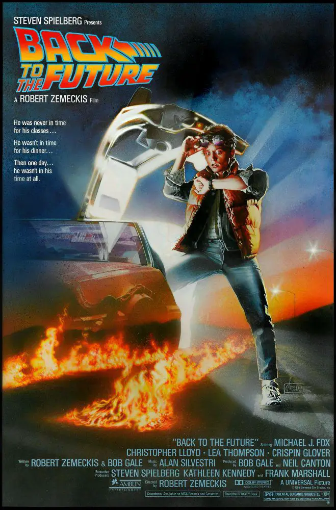
During the ’80s and throughout the ’90s (and even into the 2000s) Drew Struzan was considered the Picasso of movie poster designers and for very good reason. His posters captured the spirit of the movies they were representing. His work designing film posters began in the late ’70s when he asked to design art for the re-release of the original Star Wars. After designing the theatrical poster for 1984’s Indiana Jones and the Temple of Doom, Steven Spielberg asked the artist to design Back To the Future, the mega-hit time travel fantasy starring Michael J. Fox. Struzan, who was accustomed to designing busy, frantic, exuberant posters featuring a movie’s many cast members (such as Police Academy, Cannonball Run II and Return to Oz), used a simpler approach here. The now-iconic BTTF one-sheet featured a panicked Fox staring at his watch while standing somewhere along a fire streaked road. Other cast members would be added later on when Struzan was commissioned to design the artwork for the other two installments in the trilogy. Back to the Future was just one poster that was tied to Spielberg over a 25-year collaborative period (their last collaboration was 2008’s Indiana Jones and the Kingdom of the Crystal Skull). A collection showcasing their partnership can be seen in a best-selling coffee table book of Struzan’s work. Incidentally, this was not the only Spielberg/Struzan collaboration that year. To use a term from ’85, The Goonies was pretty rad too.
8. Twin Peaks: Fire Walk With Me (1992)
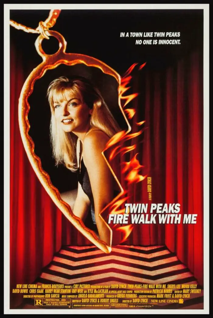
My absolute favorite moments of Twin Peaks (among many) were when we ventured into the Black Lodge, that strange other-worldy room with the long red curtains and the black and yellow zig-zag floor. So as you might imagine, no other hour of television in history has ever riveted or haunted myself more than the Season 2 finale where Agent Cooper enters that strange red curtained room to face off with Windom Earle and Killer BOB in order to save the life of Annie Blackburn. Ever since I saw that episode for the first time in 1995, I was obsessed with that room. I would dream about it, draw pictures of it during science class and could not get it out of my head. Now, I was actually not a Twin Peaks fan when the prequel movie Fire Walk With Me was released in 1992 (I was not even a teenager) so I missed out on grabbing the video poster in early ’93, but years later, I did become a fan and needed this poster of that hypnotic red room badly. How badly? I paid $70 for one on Ebay a few years ago. That’s how bad. To me, it’s still worth every penny. So while Fire Walk with Me the movie may be controversial with fans, this striking poster featuring Laura Palmer inside her broken half-heart bracelet, dangling from somewhere inside that strange, mysterious room, is a thing of pure beauty and as Twin Peaks fans know, beauty often will appear in the strangest and most darkest of places.
7. Cape Fear (1991)
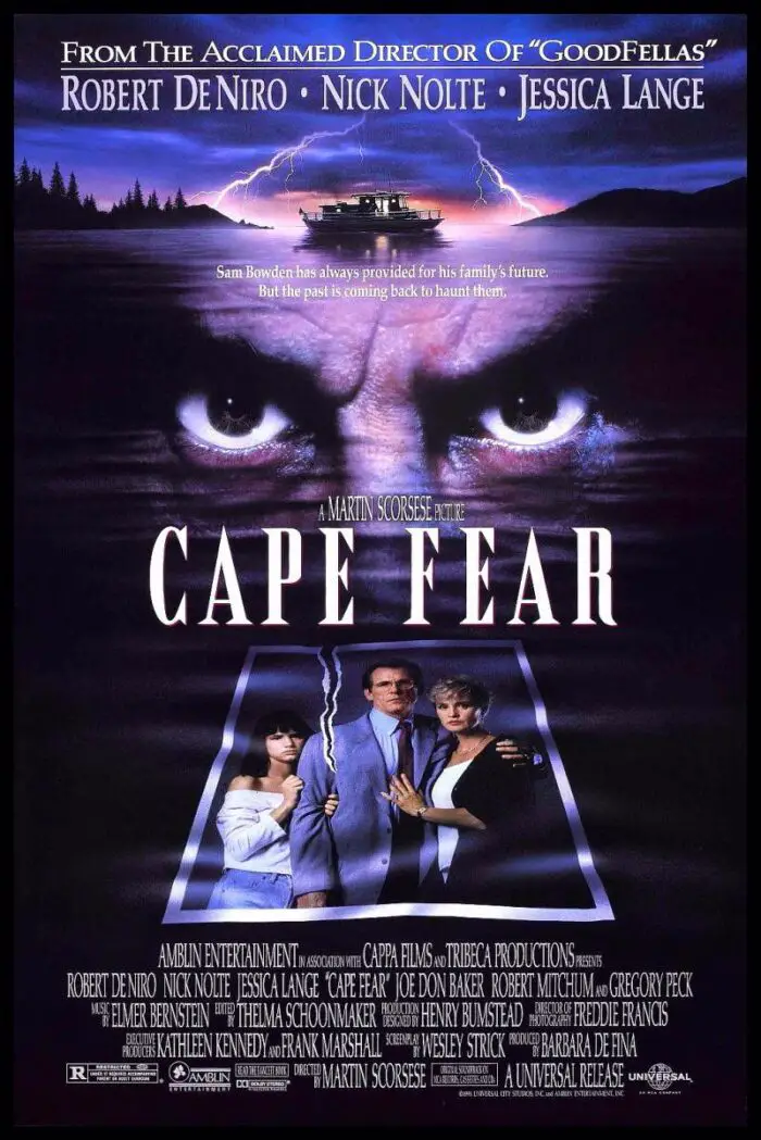
I realize cinema lovers may choose another Martin Scorsese poster as their favorite and certainly Goodfellas would rank up there as his most popular, but to me, this poster for 1991’s Cape Fear is my personal favorite. Why? Because when I look at this poster I can actually feel dread and unease. There is evil and malevolence behind those center eyes and you would not want to encounter the owner of those eyes in real life. Cape Fear opened the same year as The Silence of the Lambs but to me there has never been an issue as to which movie was more outright unsettling and nerve-shreddingly terrifying. Cape Fear takes the (honors?) by a Southern mile. This poster, illustrated by John Alvin, featuring Robert De Niro’s menacing stare burning of fury and very nasty violence underneath, above a ripped photo of a family already torn apart from distrust and tension-filled warfare is practically daring the viewer to spend time with them. 28 years after it’s release, this poster still makes my flesh grow cold and I mean that as the highest possible compliment. I also love the perverse in-joke displayed on this poster in that there’s a little E.T. in the Amblin logo at the bottom. Let’s just say that If E.T. had found himself around any of the psychologically fraught and emotionally twisted individuals of Cape Fear, he’d have gladly given himself up to those Earth scientists searching for him in a second.
6. Blade Runner (1982)
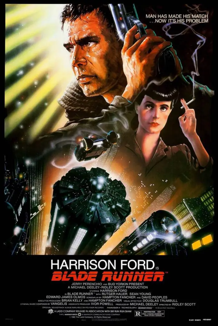
Another knockout poster by Illustrator John Alvin (who coincidentally, also designed the famous fingers touching poster design for E.T. The Extra-Terrestrial, the very movie that absolutely pummeled Blade Runner at the box-office in July, 1982). This poster blended Fritz Lang inspired sci-fi with film noir. It’s as if Metropolis combined with Chinatown and the result was this gritty but absolutely dazzling absorbing work. Much like the movie itself, there have been different poster designs associated with the various cuts. There was the video art for the uncensored version, the 1992 director’s cut (which mostly retained Alvin’s design) the 2007 Final Cut and the high-def video release which both utilized new artwork from, you guessed it, Drew Struzan. As talented as Struzan is, there’s just something about this original 1982 poster that always rings true about the movie. Sure, there’s no Roy Batty or Pris on this original as there would be in the more recent renditions and Harrison Ford doesn’t even look like Harrison Ford, but it’s atmospheric as hell and for one of the singular most atmospheric examples of film ever created by anybody in the long history of cinema (cheers, Sir Ridley), I can’t think of a more perfect image to convey that.
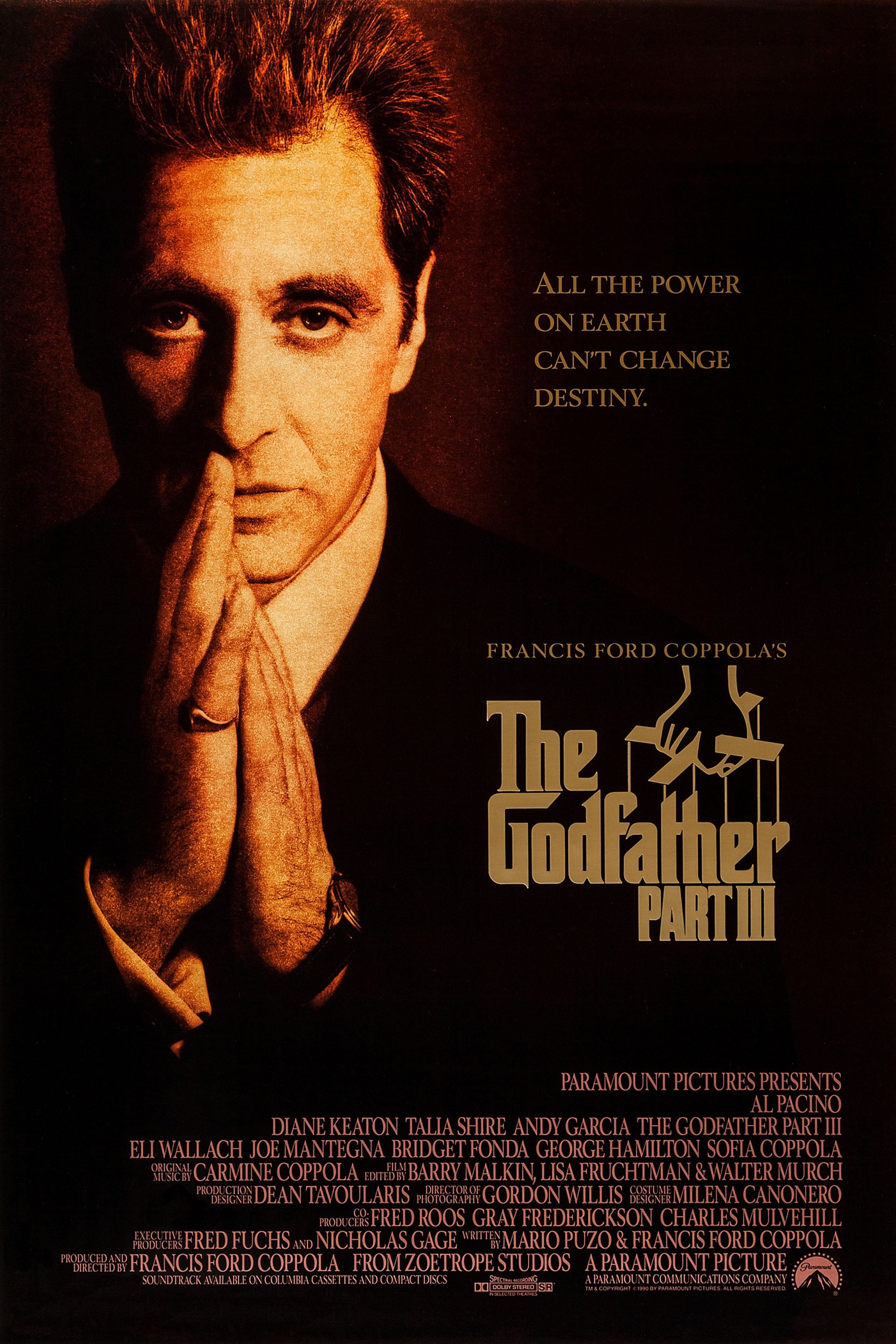
5. The Godfather Part III (advance 1990)
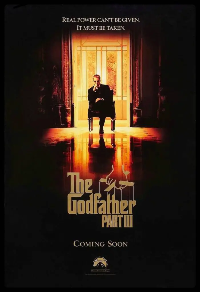
This is the only teaser poster on my list and even though the final official poster isn’t too shabby either, there’s something about this advance promo poster for 1990’s The Godfather Part III that is quietly magnificent. This image of an older Michael Corleone sitting in the middle of a Gordon Willis-ish lit empty corridor immediately invokes the final shot of The Godfather Part II where Michael was alone and alienated from those he once loved. Isolated and forced to confront the erosion of his own heart and decency. Seeing what Michael had become was chilling, even as he was sitting among the brightly colored leaves of fall. When this advance poster started appearing in the fall of 1990,16 years after the release of Part II, we see Michael is now in the fall of his life, but seeing him sitting in that same pose, we feel a slight chill as we’re reminded of the Michael Corleone we left – and hoped would regain his humanity. This evocative poster with the tagline “Real power can’t be given. It must be taken” makes us wonder if our hopes have been realized—or not.
4. Pulp Fiction (1994)
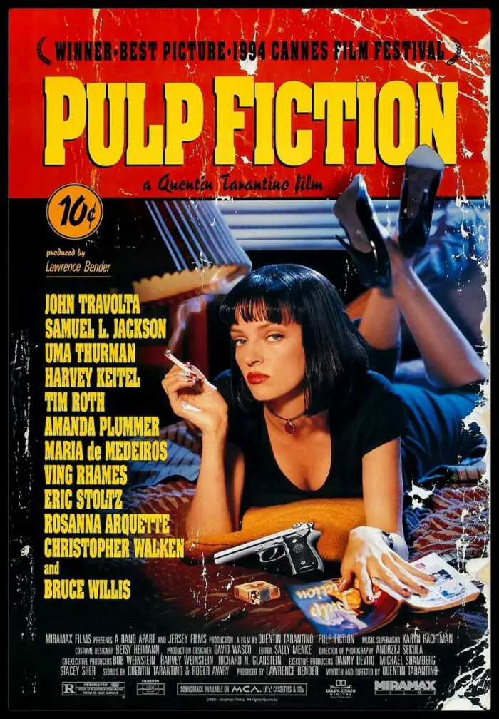
If Pulp Fiction was the movie that turned cinema on its axis during the ’90s, then it’s poster was no less revelatory. Think of some of the more less-than-creative posters made for films during that time (Silent Fall, The Specialist, Timecop, The War, etc.) These posters like the movies they were made for, were pretty much, well, forgettable. The poster for Pulp Fiction however pretty much screamed “this is the cool movie of the year and you’re going to have a great time watching it!” With it’s image of a noir-ish leading lady (an unrecognizable Uma Thurman sporting a Godard-ian Anna Karina inspired short brunette bob) while lying on a bed with nothing but a pack of Red Camel cigarettes, a gun and a tawdry pulp magazine, we wonder who might be in that seedy motel room with her and well, there’s a story right there. How many posters in recent memory can you think of that actually contains a story in them? This is the sheer brilliance of Pulp Fiction’s poster. Designed by James Verdesot, every detail is perfect from the simulated paper tears along the sides to the 10¢ price circle in the left corner. Also bold: here you had a ’90s movie with Bruce Willis in it, who was a pretty big movie star at that point, and he’s not even on the poster (for his next movie though, Die Hard With a Vengeance, his face would be the only thing on it). And just like the movie, the poster did inspire many copycats (with 1996’s 2 Days in the Valley being one of the better ones) but of course, nothing will feel as cool and original.
3. La Dolce Vita (1960)
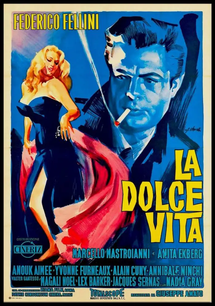
The second poster in this series from films examining the existence of upper-class Italians in 1960. This film, La Dolce Vita by Federico Fellini and Antonioni’s L’avventura not only explored certain similar themes, they opened the same year and even competed against each other at the 1960 Cannes Film Festival (this movie went on to win the festival’s grand prize, much to the dismay of the Antonioni cheer squad). La Dolce Vita was Fellini’s three hour epic examination of a dismayed gossip journalist named Marcello Rubini (Marcello Mastroianni) (who has aspirations of writing the next great serious novel) who finds himself seduced by bored but stylish wives of important men and all-night long parties in expansive Italian castles. Occasionally, he gets to spend nights alone with ultra-glamorous international starlets such as Sylvia (Anita Ekberg). Not everyone was a fan; the Catholic Church was very angry at Fellini and condemned this movie on just about every kind of moral ground imaginable (was it the extended orgy sequence towards the film’s end?) and word was that members of the church would rip down publicly displayed posters of the film wherever they saw it. Too bad, as this now legendary work of art by Giorgio Olivetti featuring a free-spirited Sylvia and Marcello gazing upon her is one of the more striking images in all of international cinema. It’s so iconic, a version of the poster even made it into Ricky Martin’s 1999 video for “Livin’ La Vida Loca.” Sorry Antonioni fans but you can’t make that claim either, can you?
2. The Empire Strikes Back (1980)
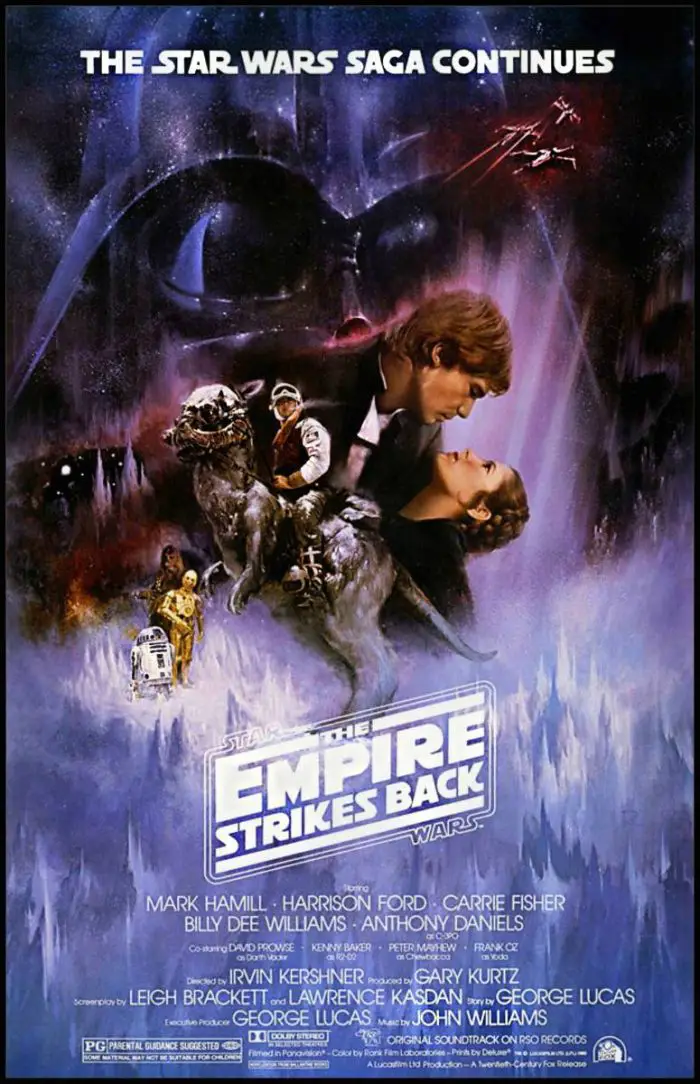
As you might have been able to surmise by now, my favorite posters are ones which provoke an emotional response within me in addition to being visually striking, original and bursting with brilliant artistry. This poster for The Empire Strikes Back accomplishes all that and more. This is the Gone With the Wind of sci-fi posters. One look at this thing and you know this is going to be a much deeper movie than Star Wars. There are no brave heroes brandishing lightsabers or ray guns anywhere on here. We have the human characters actually displaying human characteristics (love in the case of Leia and Han Solo), uncertainty (in the case of Luke riding on top of that large walking rat-like creature) and Darth Vader, looming over them all, watching their every move before he makes himself visible and then goes in for the heart-clenching kill (I’m nearly certain that Lauren Weisberger, the author of The Devil Wears Prada, based her Miranda Preistly character not on Vogue editor Anna Wintour but on Darth Vader after watching Empire Strikes Back). This poster warns the viewer that this Star Wars adventure is going to be colder, darker and more jagged than they might be prepared for. This movie wasn’t going to be pretty or play things safe. This turned out to be a great thing however and the poster for The Empire Strikes Back, just like the movie it was conceived for, turned out to be one of cinema’s all-time greatest works.
1. Raiders of the Lost Ark (1981)
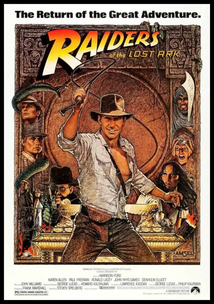
Raiders of the Lost Ark is my favorite movie of all time so it goes without question that it would be my favorite movie poster as well. Richard Amsel’s illustration is so inventive, so detailed and so visually arresting that one can practically hear the sound of that whip being lashed about when laying eyes on this work. Amsel’s previous design work included Murder on the Orient Express and The Shootist. However, it was probably his work for 1080’s Flash Gordon (which was one of Raiders of the Lost Ark’s influences) that landed him the opportunity to create the main design for the first screen collaboration between George Lucas and Steven Spielberg. Amsel created not one, but two terrific posters for Raiders. The second one featured less action and an intense portrait of Harrison Ford’s Indiana Jones and it is a wonderful poster but for me, the spirit of the movie is perfectly exemplified in this version here (which I believe may be version “A”). According to J.W. Rinzler’s 2008 book The Complete Making of Indiana Jones, another artist named Tom Jung had designed 16 original concepts for Raiders and only one of them was ordered “to color.’ In the end, none of his 16 went beyond that and Amsel’s two works became the official Raiders posters. Both would be seen in theaters that summer (version “A” would wind up as the artwork for the movie’s official 1981 soundtrack. For the 1995 expanded release, version “B” would be used). I’ve looked at this thing so often I’m now asking questions about it such as why the villain Belloq is featured on here twice and the Arab Swordsmen is featured here rather prominently even though as movie fans know, his big scene was ultimately cut (but his appearance is still one of movie history’s most memorable ones). Without any doubt, this poster is and always will be one of cinema’s most incredibly illustrated. In the words of Marcus Brody while describing the ark, “nothing else has come close.” The same could be said for Raiders of the Lost Ark’s magnificent poster.
